The majority of the functions described in the Data exploration section can be applied to compare groups of samples and perform statistical tests.
Repertoire statistics
Metadata satistics
The calculated statistics in the metaData slot can
be compared between groups of samples. plotStatistics()
function can be used for this purpose by setting the
grouped parameter to TRUE and specifying
one group column from the metadata slot to compare in
the colorBy parameter, and up to two columns in the
facetBy parameter.
plotStatistics(x = RepSeqData,
               stat = "ntClone",
               colorBy = "cell_subset",
               facetBy = "sex",
               grouped = TRUE)
Gene usage
plotGeneUsage() allows the comparison of V or J gene
usages between groups of samples using the colorBy
parameter.
plotGeneUsage(x = RepSeqData,
              level = "J",
              scale = "frequency",
              colorBy = "cell_subset",
              show_stats = TRUE)
#> [1] "Performing Wilcoxon test with Bonferroni correction for 2 groups"
Repertoire diversity
Diversity indices
Diversity indices can be compared between groups of samples using the
plotDiversity() function with the grouped
parameter set to TRUE, and the groups to be analysed
should be specified in the colorBy parameter.
plotDiversity(x = RepSeqData,
              level = "aaClone",
              index = "shannon",
              colorBy = "cell_subset",
              grouped = TRUE,
              show_stats = TRUE)
#> [1] "Performing Wilcoxon test with Bonferroni correction for 2 groups"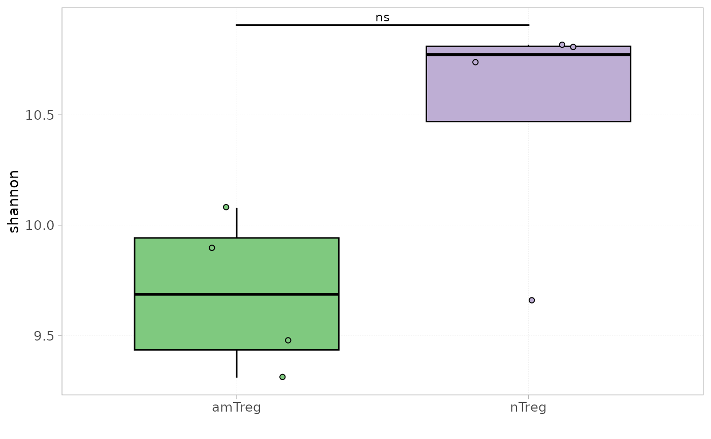
The function plotting the Renyi or the Hill profile also supports the
grouped parameter.
plotGenDiversity(x = RepSeqData,
                 Hill=FALSE,
                 level = "aaClone",
                 colorBy = "cell_subset",
                 grouped = TRUE)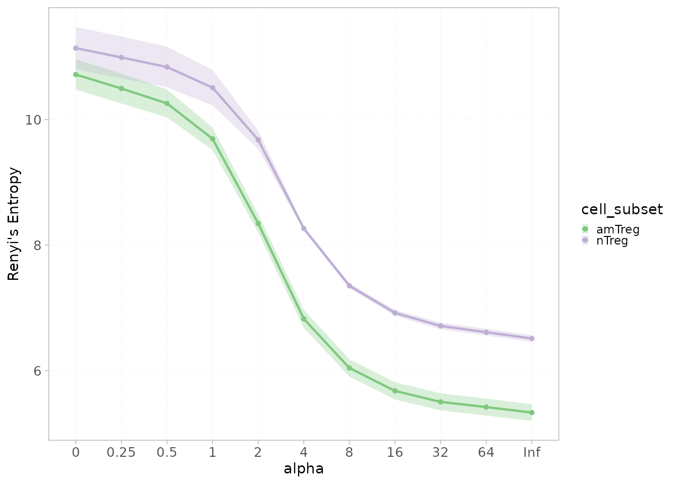
Clonal distribution
Similarly to the analysis applied at the single-sample level,
plotIntervals() allows to plot and compare clonal
distributions within defined intervals between groups.
Users can use the calculation_type parameter to toggle
between displaying:
- the proportion (relative frequency) of clones per interval
plotIntervals(x = RepSeqData,
              level = "aaClone",
              colorBy = "cell_subset",
              interval_scale = "count",
              calculation_type="distribution",
              grouped = TRUE,
              show_stats = TRUE)
#> [1] "Performing Wilcoxon test with Bonferroni correction for 2 groups"
- the cumulative frequency of clones per interval
plotIntervals(x = RepSeqData,
              level = "aaClone",
              colorBy = "cell_subset",
              interval_scale = "count",
              calculation_type="cumulative frequency",
              grouped = TRUE,
              show_stats = TRUE)
#> [1] "Performing Wilcoxon test with Bonferroni correction for 2 groups"
Similarity analysis
The repertoire sharing at any level evaluates the degree of convergence between repertoires and experimental conditions. Different statistical methods are proposed herein to evaluate this convergence.
Repertoire overlap
The number of shared sequences, at any level, between samples
belonging for instance to the same experimental group can be obtained
using the plotVenn() function. If sampleNames
is not specified, the first 3 samples in the datasets will be
analyzed.
ctrnames <- rownames(mData(RepSeqData))[which(mData(RepSeqData)[,"cell_subset" ] %in% "nTreg")]
plotVenn(x = RepSeqData,
         level = "aaClone",
         sampleNames = ctrnames)
Correlation between pairs of samples
The correlation between a pair of repertoires can be calculated using
the plotScatter() function by simply specifying a two or
more sampleNames to compare.
plotScatter(x = RepSeqData,
            level = "V",
            scale = "frequency",
            sampleNames = c("tripod-30-813","tripod-31-846"))
It is also possible to compare, for instance, all samples beloging to a specific group. In the example below, scatter plots and drawn between all pairwise nTreg samples.
names<- as.character(RepSeqData@metaData$sample_id[RepSeqData@metaData$cell_subset=="nTreg"])

plotScatter(x = RepSeqData,
            level = "VJ",
            scale = "frequency",
            sampleNames = names)
Dissimilarity indices
AnalyzAIRR proposes a list of dissimilarity indices, each taking into account different parameters. The proposed methods include:
The Jaccard similarity: a measure of similarity between sample sets defined as the size of the intersection divided by the size of the union of the sample sets.
The Morisita-Horn similarity: a measure of similarity that tends to be over-sensitive to abundant species.
Details on these indices and others can be found here
These distances can be calculated at any level of the repertoire and can be:
- Visualized as a dissimilarity heatmap using
plotDissHeatmap(). This function performs a hierarchical clustering on the calculated distance scores using the method specified in theclusteringparameter.
plotDissHeatmap(x = RepSeqData,
                  level = "aaClone",
                  method = "morisita",
                  clustering = "ward.D",
                  annotation_groups = c("sex","cell_subset"))
- Used to perform a multidimensional scaling (MDS) with
plotDissMDS().
In this case, no clustering method is needed. Ellipses are drawn
around groups as defined by the colorBy parameter.
The shapeBy parameter allows you to assign distinct
point shapes to samples based on a specified grouping variable, enabling
further differentiation among samples in the plot.
plotDissMDS(x = RepSeqData,
                 level = "aaClone",
                 method = "morisita",
                 colorBy = "cell_subset",
                 shapeBy = 'sex')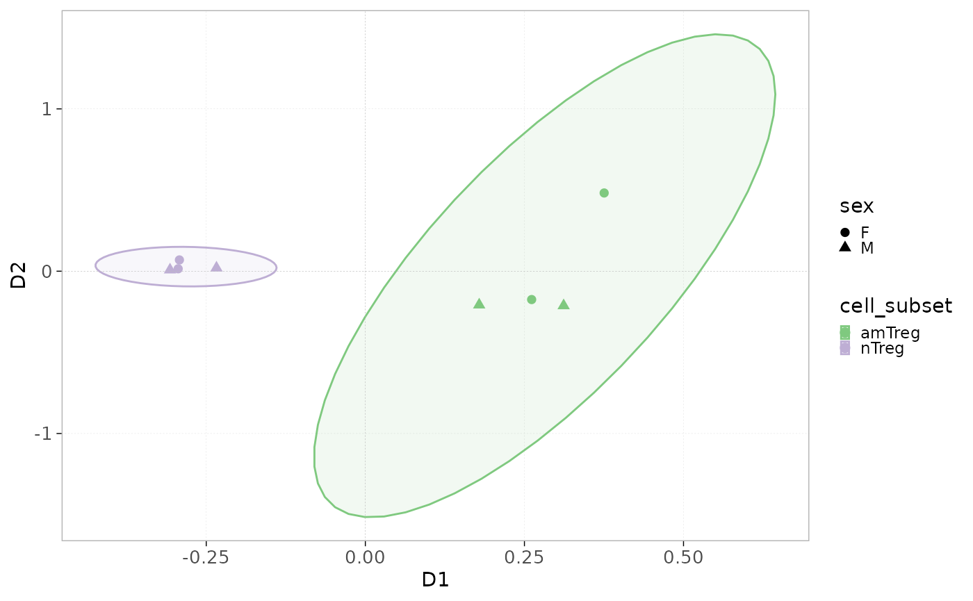
Differential analysis
Differentially expressed genes or sequences can be identified using
diffExpGroup. The experimental groups to be compared can be
specified with the group parameter, and the function
outputs the statistics calculated for each gene/sequence.
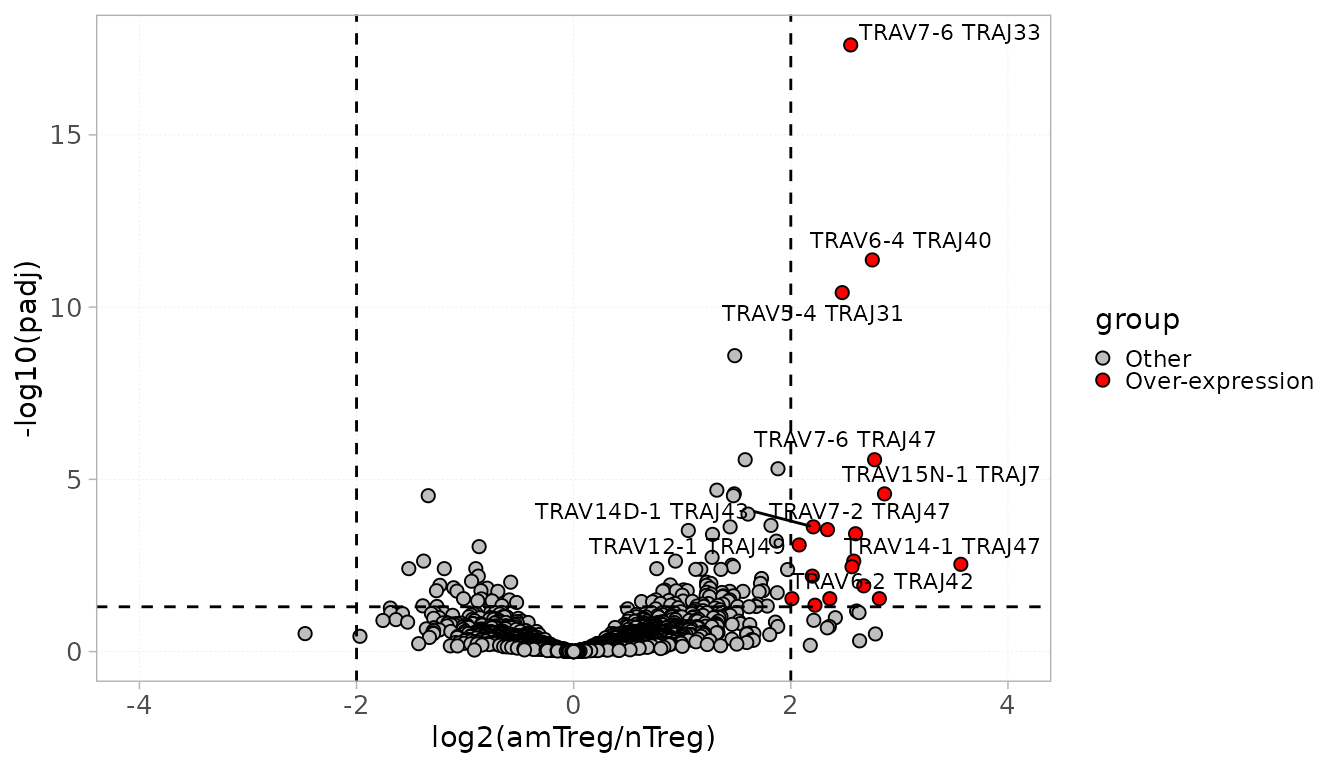
In the following example, we identify over-expressed VJ combinations within the amTreg samples compared to the nTregs.
DS <- diffExpGroup(x = RepSeqData,
                   colGrp = "cell_subset" ,
                   level = "VJ",
                   group = c("cell_subset", "amTreg", "nTreg"))
The results can be visualized using the plotDiffExp
function into a volcano plot.
Users can specify the number of top differentially expressed
genes/sequences to be identified on the plot using the top
parameter.
It is also possible to choose a log2FoldChange and an adjusted pvalue threshold, based on which the over- and down-expression will be defined. By default, these parameters are fixed to 2 and 0.05 respectively.
plotDiffExp(x = RepSeqData,
            top = 10,
            level = "VJ",
            group = c("cell_subset", "amTreg", "nTreg"))