Descriptive analyses can be applied on each repertoire individually. These analyses include the ones described in the Data exploration section in addition to other metrics.
In all the following functions, the sample_id of
interest needs to be specified in the sampleName parameter.
If not specified, the first sample_id in the dataset
will be analyzed.
Repertoire statistics
Metadata statistics
The plotIndStatistics() function allows the positioning
of the sample of interest within the whole dataset, based on a set of
statistic metrics. Boxplots are drawn on the whole dataset values, on
which the sample of interest is highlighted as a red cross. This allows
the comparison of the sample to the whole dataset, and the detection of
sample outliers.
To plot statistics in the metaData slot, the
stat parameter should be set to statistics
in the metaData slot.
plotIndStatistics(x = RepSeqData,
                  stat = "metadata",
                  level = "aaClone")
#> Plot the first sample in the dataset: tripod-30-813
V and J gene usages
V-J combination usages can be visualized in a heatmap using the
plotIndGeneUsage() function. The parameter
level allows to choose whether to compute gene usages at
the ntClone or aaClone level. V and J gene usages are plotted separately
at the top and right side of the heatmap, allowing a better view of the
individual gene distribution.
plotIndGeneUsage(x = RepSeqData,
                 level = "aaClone",
                 sampleName = NULL)
#> Plot the first sample in the dataset: tripod-30-813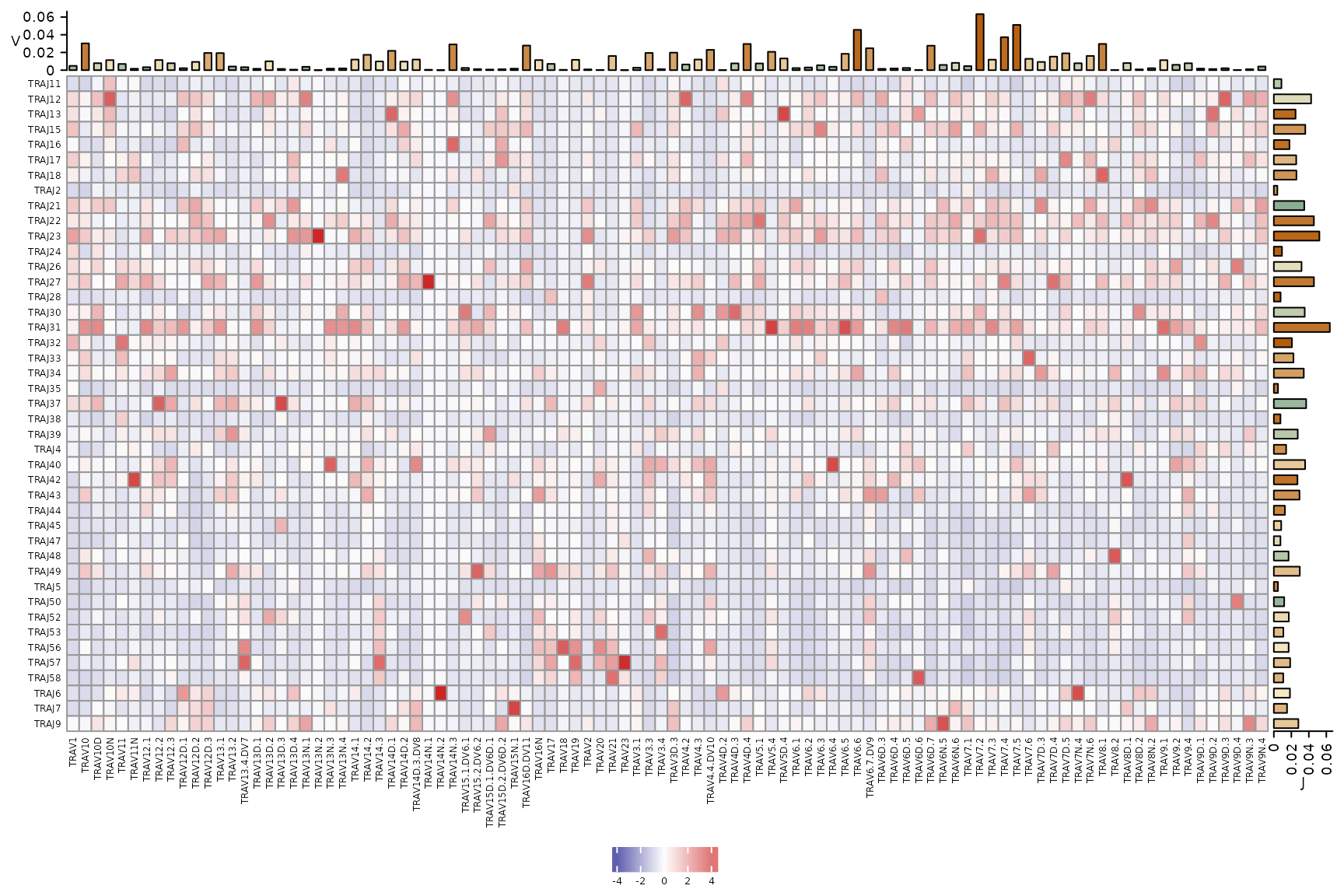
Repertoire diversity
The plotIndStatistics() function can also be used to
plot diversity indices by setting the stat parameter to
diversity.
plotIndStatistics(x = RepSeqData,
                  stat = "diversity",
                  level = "aaClone")
#> Plot the first sample in the dataset: tripod-30-813
Clonal distribution
Tree map
To visualize the repertoire structure and the top clone distribution
in a repertoire, plotIndMap() can be used to plot a
circular treemap in which each circle represents a unique clone, and the
circle size corresponds to the clone count. Users can choose the
proportion of the top clones to plot using the prop
parameter. We recommend to plot up to the top 10,000 clones, as higher
values might generate difficult-to-interpret visuals.
plotIndMap(x = RepSeqData,
           sampleName=  NULL,
           level = "aaClone",
           prop = 0.01)
#> Plot the first sample in the dataset: tripod-30-813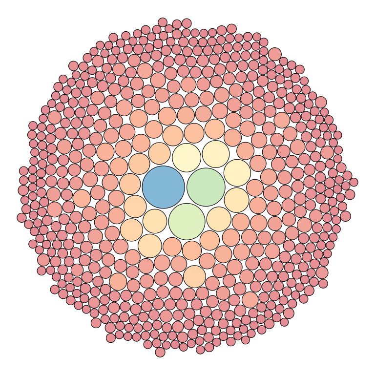
Intervals
The plotIndIntervals() function can be used to
quantitatively analyze the above plot, by evaluating the clonal
distribution per intervals of counts or fractions in a single
sample.
plotIndIntervals(x = RepSeqData,
                 level = "aaClone",
                 sampleName = "tripod-30-813",
                 interval_scale = "frequency")