data("RepSeqData")
print(colnames(RepSeqData@metaData))
#>  [1] "sample_id"   "cell_subset" "sex"         "nSequences"  "V"
#>  [6] "J"           "VJ"          "ntCDR3"      "aaCDR3"      "aaClone"
#> [11] "ntClone"     "chao1"       "iChao"
AnalyzAIRR proposes a series of metrics that can be performed on each sample within the dataset, enabling its exploratory description. This process can facilitate the detection of potential outliers or contaminants within the data.
Descriptive statistics
metaData statistics
Statistics in the metaData slot, either calculated
during the building of the RepSeqExperiment object or supplied by the
user in the metadata file, can be visualized for each sample using the
plotStatistics() function with the colorBy
parameter set to the sample id column.
plotStatistics(x = RepSeqData,
               stat = "nSequences",
               colorBy = "sample_id")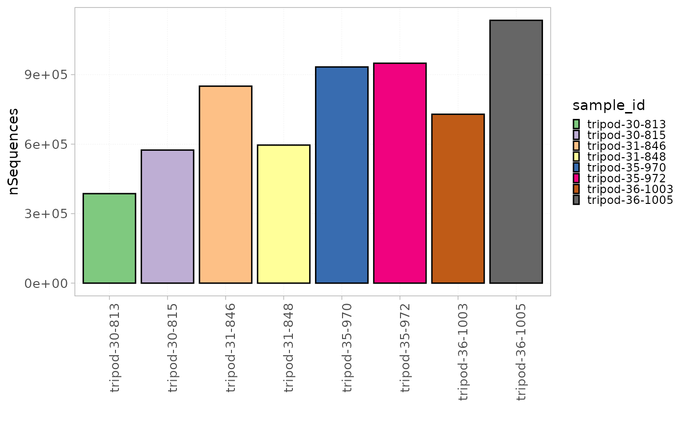
Groups of samples can be separated using the facetBy
parameter.
plotStatistics(x = RepSeqData,
               stat = "ntClone",
               colorBy = "sample_id",
               facetBy = "cell_subset")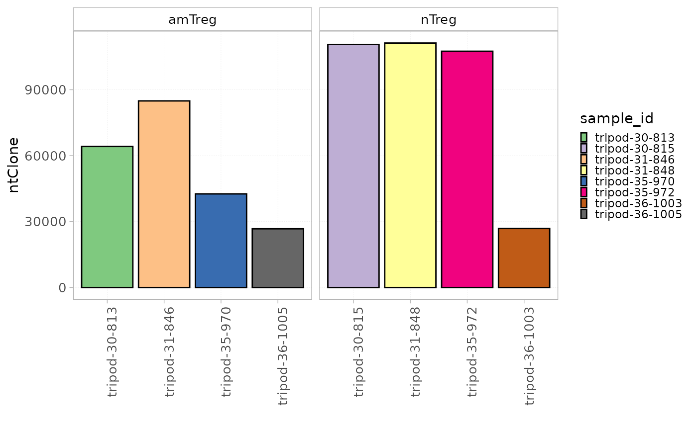
Repertoire feature calculation
countFeatures() returns the calculated values for all
the samples within the RepSeqExperiment object.
The function takes into account the weight of the studied level, i.e. the number of sequences expressing a specific gene segment, or the count of a sequence in a sample.
countFeatures(x = RepSeqData,
              level = "J",
              scale = "frequency")
Richness and diversity estimation
Rarefaction analysis
To evaluate the clonal richness and the sequencing depth of a sample, a rarefaction curve can be plotted, which illustrates the relationship between the number of sequences randomly selected from the sample and the number of clones they represent. A plateau in the curve suggests that sampling is yielding few or no new species, and that the observed clonal richness is approaching the true richness in the sequenced sample. In contrast, a steep ascending curve indicates that additional sequencing may still yield new clones.
Rarefaction curves can be plotted using
plotRarefaction(). The colorBy parameter is
used to assign colors to the curves based on any group column from the
metaData slot, and facetBy to separate the
samples based on a different set of group columns.
plotRarefaction(x = RepSeqData,
                colorBy = "sample_id")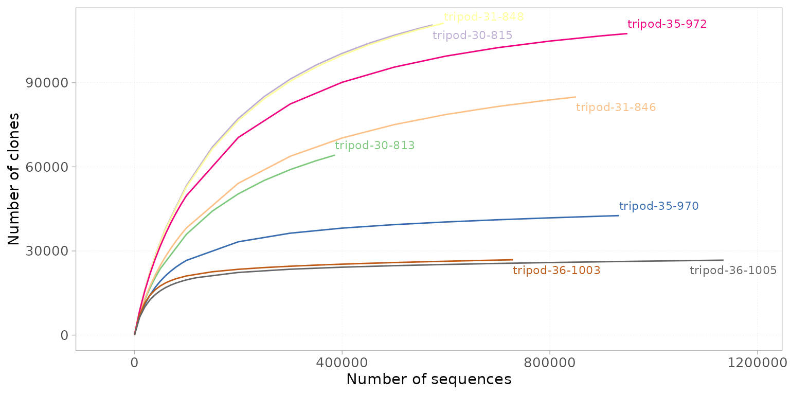
Richness estimation
To calculate the number of clones that are not observed in the sample, the Chao index can be used. The Chao index is a statistical estimator used to predict species richness by accounting for rare species. It can be applied in AIRR studies to address the limitation of undercounting species due to low sampling/sequencing depth.
Explicitly, it predicts the total clone richness in a sample, including those that are present but not observed due to sampling limitations. The Chao1 index and rarefaction curves serve complementary roles: rarefaction curves assess the sufficiency of sampling effort and visually represent the accumulation of observed richness as sampling increases, while the Chao1 index provides a statistical estimate of the total richness by accounting for rare, unobserved clones.
The Chao index, which values are available in the
metaData slot, can be plotted using the
plotStatScatter() function. This function plots the values
of two statistics along two axes, showing the relationship between them.
Chao values can thus be plotted against the number of observed ntClones
for instance, to evaluate the difference in the number of observed and
unseen clones.
plotStatScatter(x = RepSeqData,
                stat1 = "chao1",
                stat2 = "aaClone",
                colorBy = "sample_id")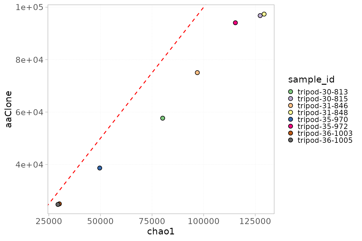
Note: The plotStatScatter() function
can be used to compare any two numerical values in the
metaData slot.
Diversity indices
The function diversityIndices() computes a set of
diversity indices on a chosen repertoire level for each sample. The
calculated indices are the following:
Shannon index: Calculates the proportional abundance of species in a repertoire (Shannon, 1948).
Simpson index: a measure taking into account the number of species present as well as their abundance. It gives relatively little weight to the rare species and more weight to the frequent ones (Simpson, 1949).
Inverse Simpson index: Is the effective number of species that is obtained when the weighted arithmetic mean is used to quantify average proportional abundance of species.
Berger-Parker index: Expresses the proportional importance of the most abundant species. This metric is highly biased by sample size and richness (Berger and Parker 1970).
Gini coefficient: Measures the degree of inequality in a distribution of abundances (Gini, 1921).
diversityIndices(x = RepSeqData,
                 level = "aaClone")
The calculated indices can be downloaded as a table for use in other
visualization platforms or tailor the presentation of the data to
address specific research needs.
Alternatively, using the plotDiversity() function in
AnalyzAIRR, it is possible to calculate and plot any of
these indices all in one step. The parameter index allows
to choose the index to be plotted.
plotDiversity(x = RepSeqData,
              level = "ntClone",
              index = "shannon",
              colorBy = "sample_id")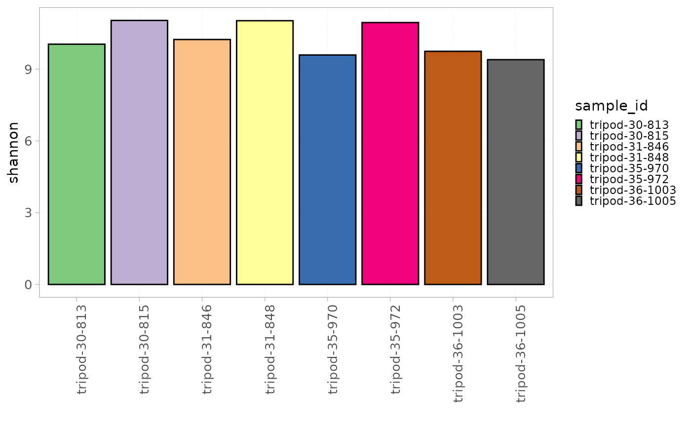
Generalized diversity
Rényi and Hill diversity are families of diversity indices used to quantify diversity by capturing both species richness (the number of species) and evenness (how evenly individuals are distributed among species).
Rényi diversity (or Rényi entropy) is a generalization of several classic diversity measures, introducing a parameter alpha that allows the index to emphasize different aspects of diversity. By varying this parameter, Rényi diversity can represent different indices: at 1, it corresponds to the Shannon index, and at 2, to the logarithm of the inverse Simpson index. Rényi diversity profiles are useful for comparing the diversity and evenness of different communities across a range of scales.
Hill diversity (Hill numbers or true diversity) transforms classic diversity measures into the effective number of equally abundant species, making interpretation intuitive. Orders 0, 1, and 2 correspond to species richness, the exponential of Shannon entropy, and the inverse Simpson index, respectively. A key advantage of Hill numbers is the doubling property: when combining two completely distinct, equally diverse communities, the overall diversity doubles. This replication principle aligns with intuitive expectations and is not shared by most traditional indices.
Rényi and Hill diversity values can be computed at any repertoire
level using generalizedDiversity(). By default, it is
calculated for the following alpha values:
but any set of values can be given to the alpha
parameter.
generalizedDiversity(x = RepSeqData,
                     Hill = FALSE,
                     level = "aaClone")
Rényi and Hill diversity values can be plotted using
plotGenDiversity() with the Hill parameter set
to FALSE or TRUE, respectively. A curve for each sample is plotted and
colors are attributed based on the colorBy parameter.
plotGenDiversity(x = RepSeqData,
                 Hill=TRUE,
                 level = "aaClone",
                 colorBy = "sample_id",
                 facetBy = c("cell_subset", "sex"))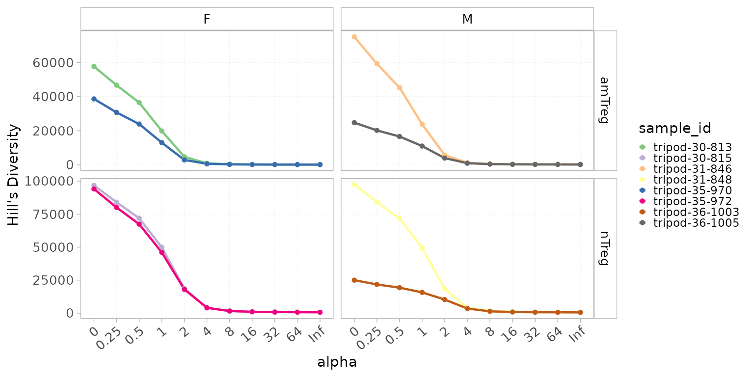
Clonal distribution
Intervals
The Intervals() function can be used to assess the
clonal distribution within pre-defined count or frequency intervals.
It computes:
- The proportion that the repertoire level within each interval represents in the total repertoire, thus giving a global evaluation of the distribution.
- The cumulative frequency of the repertoire level within each interval, thus giving the proportion that each interval occupies in the repertoire.
Intervals(x = RepSeqData,
          level="aaCDR3",
          interval_scale="count")
The plotIntervals() function can be used to plot these
intervals.
plotIntervals(x = RepSeqData,
              level = "aaClone",
              interval_scale = "frequency",
              facetBy = "cell_subset",
              calculation_type="distribution")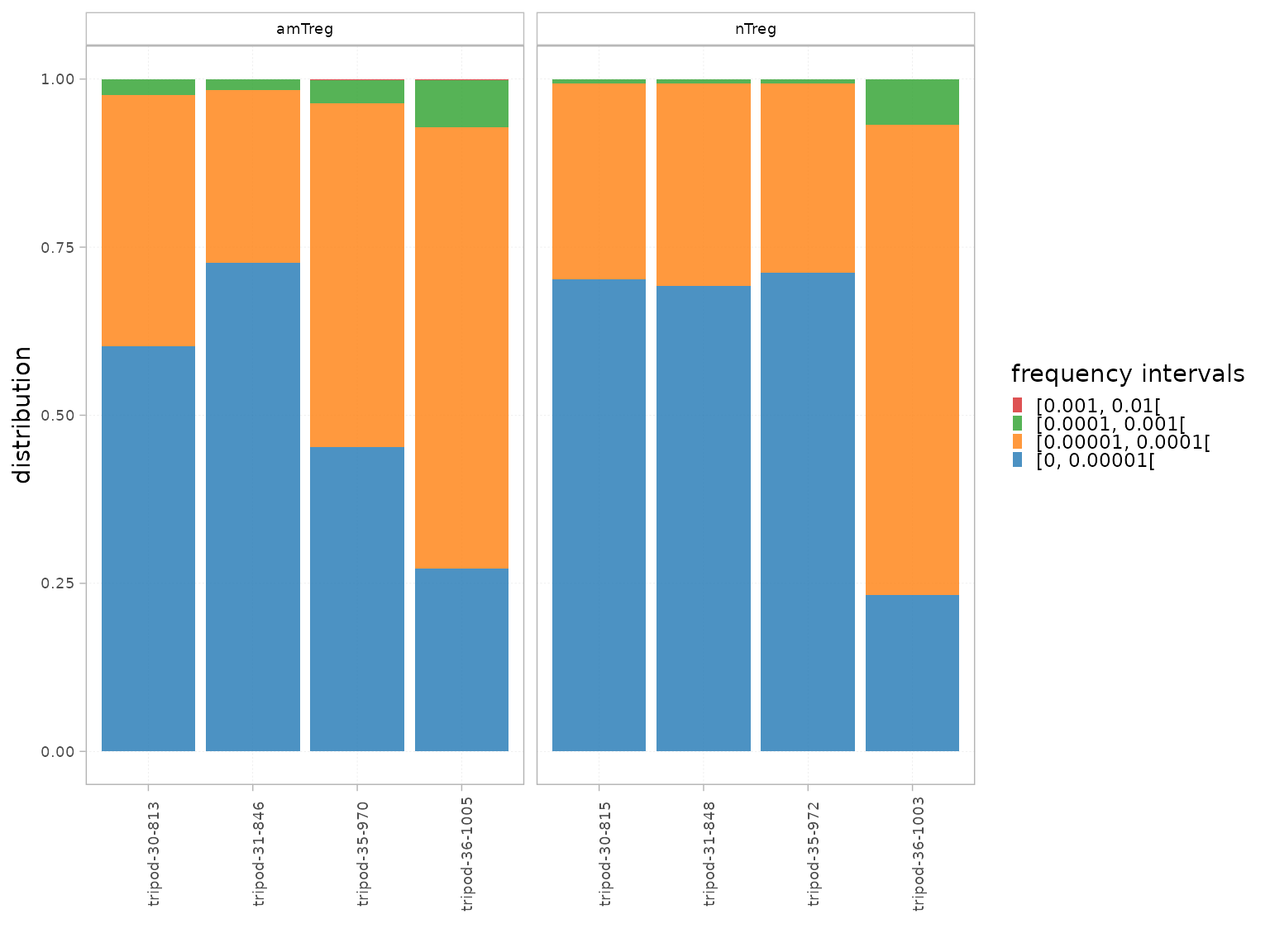
plotIntervals(x = RepSeqData,
              level = "aaClone",
              interval_scale = "frequency",
              facetBy = "cell_subset",
              calculation_type="cumulative frequency")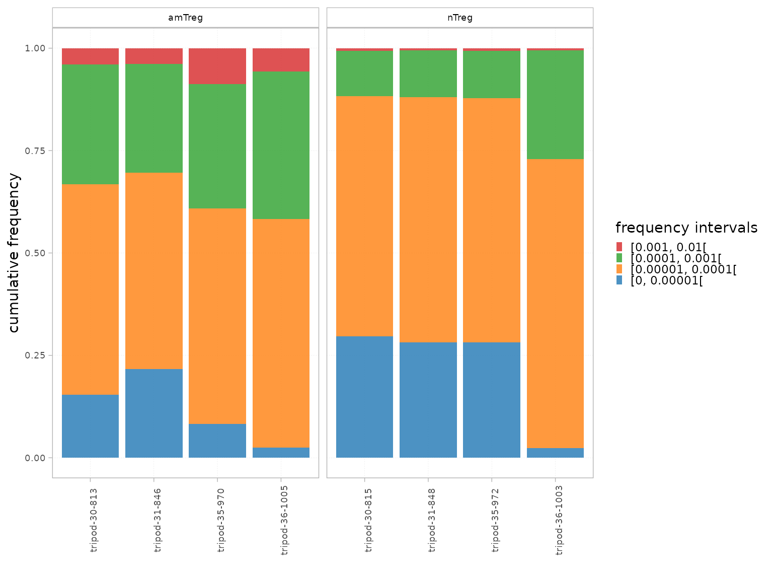
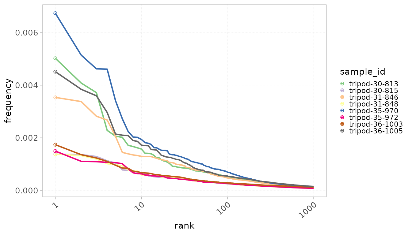
Rank
Another way to assess the clonal distribution is by visualizing the
distribution as a function of clone ranks. Samples can be colored by
sample_id as well as by any group column from the
mData() slot. The ranks parameters allows to
plot only the top X ranks within the repertoires.
When colorBy = “sample_id”, the color legend is hidden
for visual clarity. However, it can be easily added as in the example
below.
plotRankDistrib(x = RepSeqData,
                level = "aaClone",
                colorBy = "sample_id",
                scale = "frequency",
                ranks = 1000,
                grouped = FALSE)+
  ggplot2::theme(legend.position = "right")